 |

|
Page 1 of 1
|
[ 8 posts ] |
|
| Author |
Message |
|
kitensei
Experienced pChart user
Joined: Fri Apr 08, 2011 10:45 am
Posts: 27
|
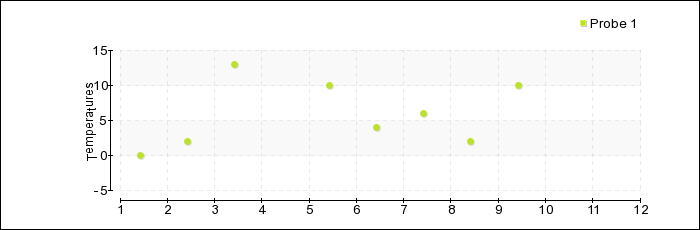
 X-Axis Hello, I would like to know how to "unlink" the X-Axis and the graph. Basically I would like to do something like this download/file.php?id=122I have some IMC measures that i'd like to display on a 24h timeline, the trouble is that in the sample files provided, every graph point match exactly an X-Axis point, and this isn't really correct. For example, I can have 18 measures on 24 hours, and i'd like to display it at the times it were taken, is it possible ? Sorry for my bad english.
|
| Fri Apr 08, 2011 10:51 am |

|
|
|
leew
Experienced pChart user
Joined: Mon Mar 14, 2011 10:16 pm
Posts: 23
|
Re: X-Axis I'm not 100% sure if this is what you need but you could look at this. Code: $scaleSettings = rray("XMargin"=>5,"YMargin"=>5,"Floating"=>TRUE,"GridR"=>50,"GridG"=>50,"GridB"=>50,
"DrawSubTicks"=>TRUE,"CycleBackground"=>TRUE,"LabelSkip"=>$skip_labels, "LabelRotation"=>90,
$skip_labels = 100;
LabelSkip"=>$skip_labelsLee
|
| Mon Apr 11, 2011 10:56 pm |
|
|
|
kitensei
Experienced pChart user
Joined: Fri Apr 08, 2011 10:45 am
Posts: 27
|
Re: X-Axis thanks, skipLabels is what I needed. Now I just have to format a little bit my graph but basically it's done, thanks a lot 
|
| Tue Apr 12, 2011 7:43 am |
|
|
|
kitensei
Experienced pChart user
Joined: Fri Apr 08, 2011 10:45 am
Posts: 27
|
Re: X-Axis eeeww, after trying some differents setups, that's not really what I do need :/, let me be more specific.
What I'd like to do basically, is to draw X and Y axis with manually set points (Y axis is ok, but X not yet), and then draw a graphic over it so I can place my points where I want.
The main problem for me it's that I have random measures at random times, and I need to display them on a formatted axis (1 week, 1 month etc...) If i display directly the measures on X-axis, the timeline is scattered and do not flow as the time do.
Is it possible with pCharts to draw a point on the graph without displaying it on the X-axis ?
|
| Wed Apr 13, 2011 3:08 pm |
|
|
|
leew
Experienced pChart user
Joined: Mon Mar 14, 2011 10:16 pm
Posts: 23
|
Re: X-Axis Hmmm, are you saying if you have an X axis scale for example in seconds like
3
2
1-----*---------------------
0-*-------*-----------------
1---2---3---4---5---6---7---8
you want to put a point (*) on the graph in between the second marks?
Even better is if you can create a sample graph showing what you need, even
if its in Excel, MS Paint, or Word it would help.
Thanks
Lee
|
| Wed Apr 13, 2011 6:02 pm |
|
|
|
kitensei
Experienced pChart user
Joined: Fri Apr 08, 2011 10:45 am
Posts: 27
|
Re: X-Axis Hi lee, thanks a lot for your time, What you draw is exactly what I want, I need to put some points independently from X axis, like this  So my points can be on axis or not, and with the X axis directly drawn from the addpoint() method it isn't possible
|
| Thu Apr 14, 2011 8:54 am |
|
|
|
leew
Experienced pChart user
Joined: Mon Mar 14, 2011 10:16 pm
Posts: 23
|
Re: X-Axis Anything is possible if you mess with the code enough. Attachment:
 margin.png [ 7.59 KiB | Viewed 9222 times ]
But I wouldn't recommend messing with the class code.  But to get serious, I can't think of why you would need to put a data point in between two points in time but you can still make the chart look like it with a combination of changing your addPoints data and using LabelSkip. Beyond that you would have to mess with the pChart source and I'm not sure that's allowed. Good Luck Lee
|
| Thu Apr 14, 2011 7:41 pm |
|
|
|
kitensei
Experienced pChart user
Joined: Fri Apr 08, 2011 10:45 am
Posts: 27
|
Re: X-Axis that's what I did finally , and that's why I needed to put points between two time points : Imagine a patient, temperature surveillance for a week or so, the nurse take his temperature randomly (once every 20min, 30min etc...) so if I want to display a week of measures I have to choice : - display an X axis completely shattered (8h, 8h05, 8h37, 8h59 and so..) - generate N measures VOID and format my graphic so my axis is like a timeline (8h00, 9h00, 10h00...) and then place my points on "fake" axis hidden by labelskip (I did it like that) thanks for your help anyway Kitensei
|
| Fri Apr 15, 2011 7:55 am |
|
|
|
|
Page 1 of 1
|
[ 8 posts ] |
|
Who is online |
Users browsing this forum: No registered users and 24 guests |
|
You cannot post new topics in this forum
You cannot reply to topics in this forum
You cannot edit your posts in this forum
You cannot delete your posts in this forum
You cannot post attachments in this forum
|

|
|